Gery gasby brand.
ice cream homemade
Project info
Duration: 2 weeks
Role: UX Designer & UI Designer
Team: Solo project
Skils: User Research & Analysis, Wireframing & Prototyping, Visual Design, Interaction Design, Motion Graphics, Iterative Design
Project overview
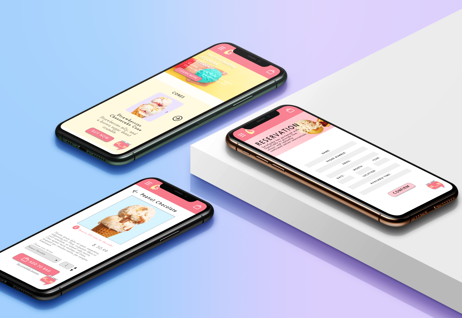
For this project, I chose to design the logo and website for an ice cream shop in Toronto, as part of a larger initiative to create either a restaurant or food brand identity. I decided to focus on an ice cream shop, aiming to create a unique, fun, and inviting experience both visually and functionally. This project involved designing a logo that represents the brand's playful and friendly nature, as well as creating a user-friendly desktop and mobile website to showcase the shop’s offerings.
Challenges
Brand Identity Alignment: Ensuring that the logo and website design reflected the ice cream shop’s playful, friendly atmosphere while also appealing to a broad audience.
Responsive Design: Designing a website that functions seamlessly on both desktop and mobile platforms. Ensuring the user experience remains consistent and intuitive across different screen sizes required careful attention to layout, navigation, and functionality.
Color and Visual Appeal: Choosing the right color palette and imagery to reflect the fun and inviting nature of an ice cream shop while maintaining a professional appearance that resonates with the target audience.
Process
tools
Moodboard
My moodboard is designed to evoke the essence of summer, featuring vibrant and playful elements that reflect the joy and fun of enjoying ice cream. I drew inspiration from retro family aesthetics, using bright, cheerful colors and nostalgic design styles to create a welcoming, friendly atmosphere. The use of fruity elements represents the variety of ice cream flavors, adding a fresh and lively touch. The overall feel is warm, inviting, and full of positive energy, perfectly capturing the essence of an ice cream shop that brings people together for a sweet, unforgettable experience.
Morphological Matrix
The morphological matrix was used to explore various design possibilities for the ice cream shop logo, based on key elements identified during the research phase. To ensure the logo effectively represents the brand, I categorized and combined potential visual components, such as ice cream sticks, cones, fruits, mascots, mouths, snowflakes, and animals. Each element was carefully considered for its ability to communicate the playful and cool nature of the ice cream shop, allowing for a wide range of creative logo combinations that stayed true to the brand’s identity and appeal.
B/W Logos Sketches
Colored Logos Sketches
Chosen logo
This logo was chosen because it best represents the essence of the ice cream shop. The design captures the friendly and approachable personality of the brand, using soft, inviting colors that reflect the joyful and fun nature of enjoying ice cream. The logo is simple yet effective, creating an immediate connection with the brand and making it easily recognizable.
Sketches Icons
Website Icons
About Page
Wireframe & Hi-fi
Reservation Page
Wireframe (Desktop)
Wireframe & Hi-fi
Menu Page
Wireframe & Hi-fi
Item Page
Wireframe & Hi-fi
Reservation
Wireframe & Hi-fi
Wireframe (Mobile)
item
Wireframe & Hi-fi


