UX / UI Design
Mass Effect - UI Redesign
Project info
Duration: 2 months
Role: UX Designer & UI Designer
Team: Solo project
Skils: User Research & Analysis, Wireframing & Prototyping, Visual Design, Interaction Design, Motion Graphics, Iterative Design
Project overview
The goal of this project was to redesign the user interface (UI) for the 2007 release of Mass Effect, a critically acclaimed sci-fi action RPG. The original UI, while functional, presented opportunities for improvement in areas such as accessibility, visual hierarchy, and thematic consistency.
Challenges
Deciding on Design Tools:
Choosing the right tools for each step of the design process was a complex and time-consuming task. From wireframing to prototyping and motion design, ensuring each tool was appropriate for its purpose required careful consideration and adaptability.
Finding a Target Audience for the Survey:
Identifying participants who were familiar with Mass Effect or had experience playing games was challenging.
Creating Motion Design:
Adding motion elements to the final design to make the UI feel more dynamic and realistic was a significant challenge.
tools
Creative Process
-
1. Research & Discovery
Conducted an analysis of existing games with similar themes to understand effective UI design patterns and gather inspiration for improvements.
-
2. User Survey
Engaged users to identify pain points and areas for improvement in the original Mass Effect UI, ensuring the redesign addresses player needs.
-
3. Sketches & Wireframe
Created initial sketches and wireframes to conceptualize the new UI layout and functionality, laying the foundation for the redesign.
-
4. Peer Reviews
Shared designs with peers for feedback, iterating on the design to enhance usability, aesthetics, and alignment with the game's theme.
-
5. High-Fidelity Mockup
Developed a polished, final design, incorporating all insights and revisions, to present a refined and cohesive UI experience.
Research & Discovery
To understand the elements that contribute to a successful UI in action-adventure and sci-fi game, I conducted a comparative analysis between these well-regarded titles:
The Callisto Protocol
Final Fantasy XV
Death Stranding
Star Wars: Jedi Survivor
-
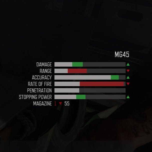
Days Gone
Use different colors to compare the stats of the equipped item and the selected item, making it easier for players to recognize the differences.
-
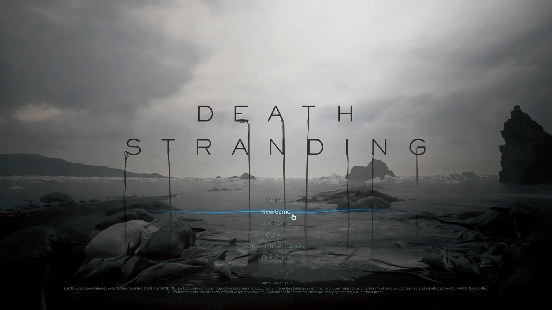
Death Stranding
Use different colors to compare the stats of the equipped item and the selected item, making it easier for players to recognize the differences.
-
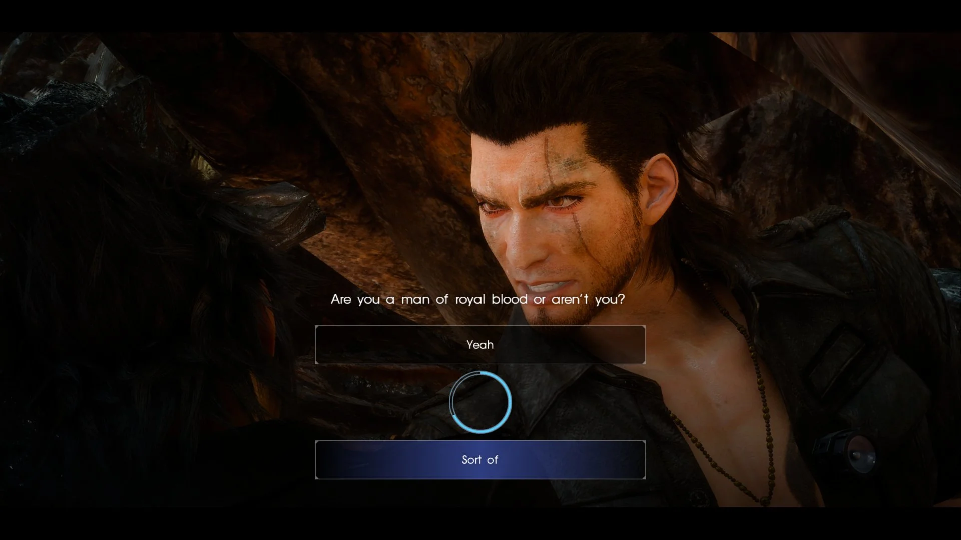
Final Fantasy XV
Dialogue choices are crucial in RPGs with multiple endings, so they should be clear and straightforward, making it difficult to make the wrong selection.
From a 10-questions survey, I received 10 responses. (Oct 4, 9:44 p.m.)
Sketches & Wireframe
Final Result
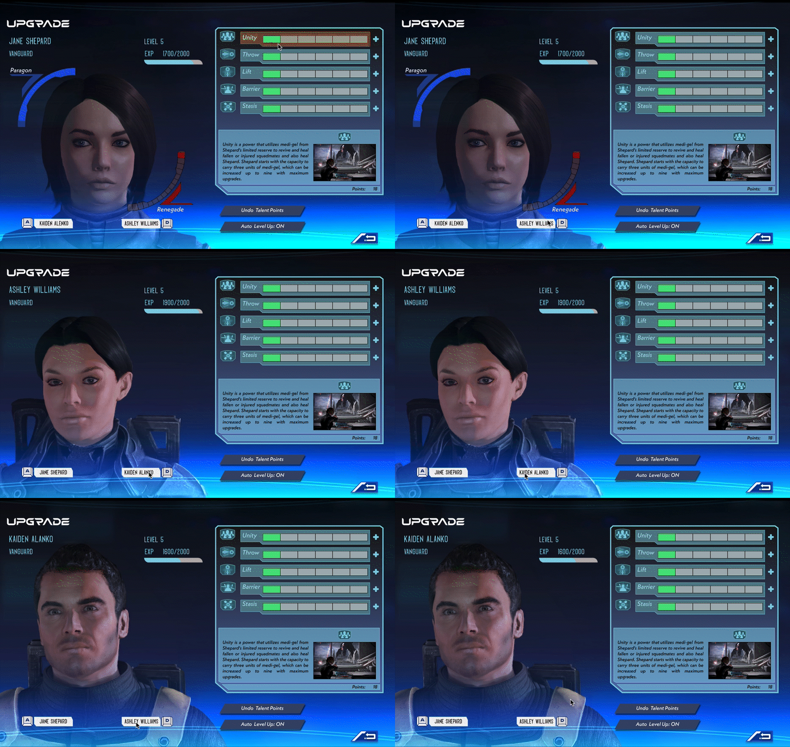
Upgrade
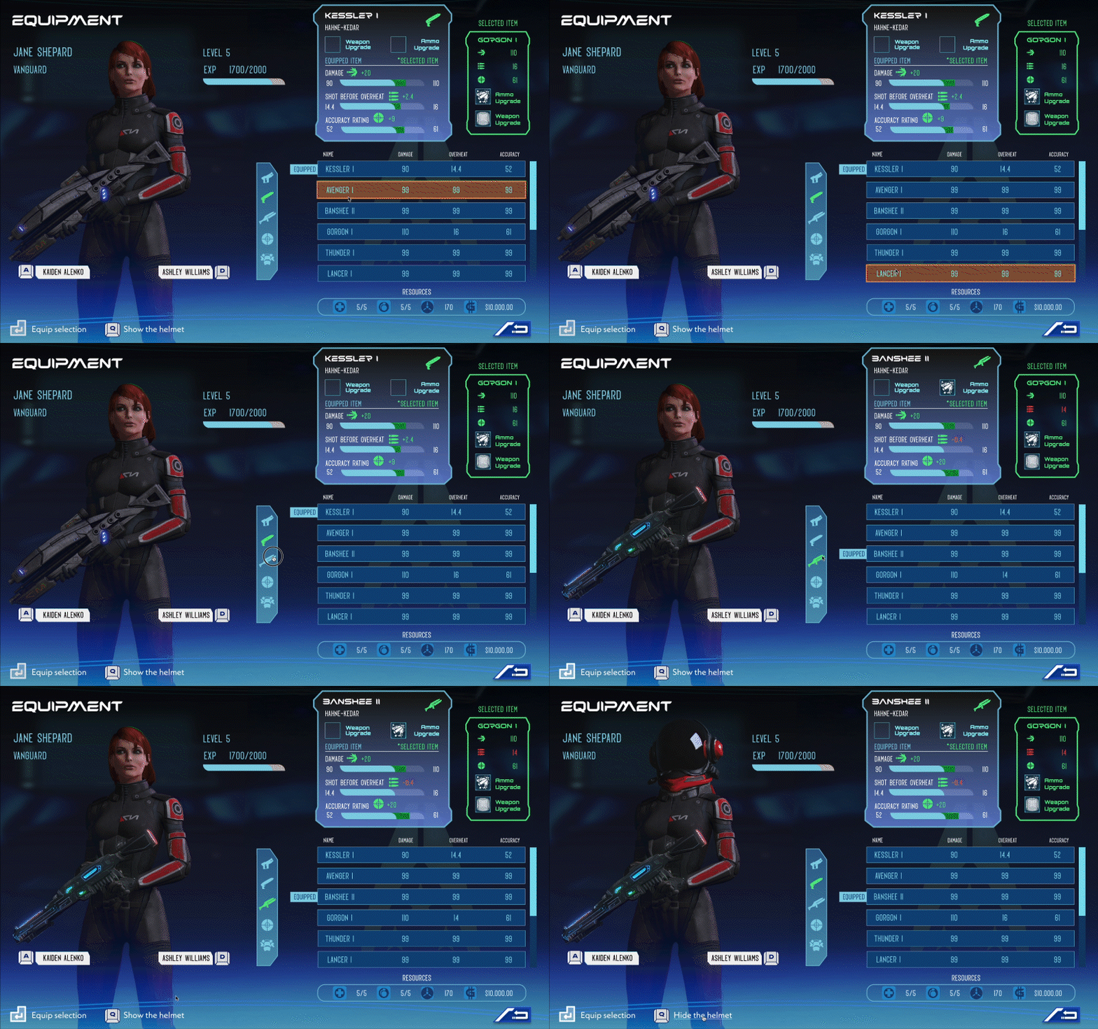
In the redesigned Equipment page, players can use shortcut keys for quick and intuitive navigation. For instance, pressing A D allows players to switch between characters to change their equipment seamlessly, while pressing Q toggles the helmet on or off.
To improve clarity, I introduced a color-coded comparison system: green indicates that the selected weapon has better stats (e.g., higher damage, better accuracy, or lower overheat levels), while red means lower stats compared to the currently equipped item. This visual feedback ensures players can quickly and easily evaluate their choices.
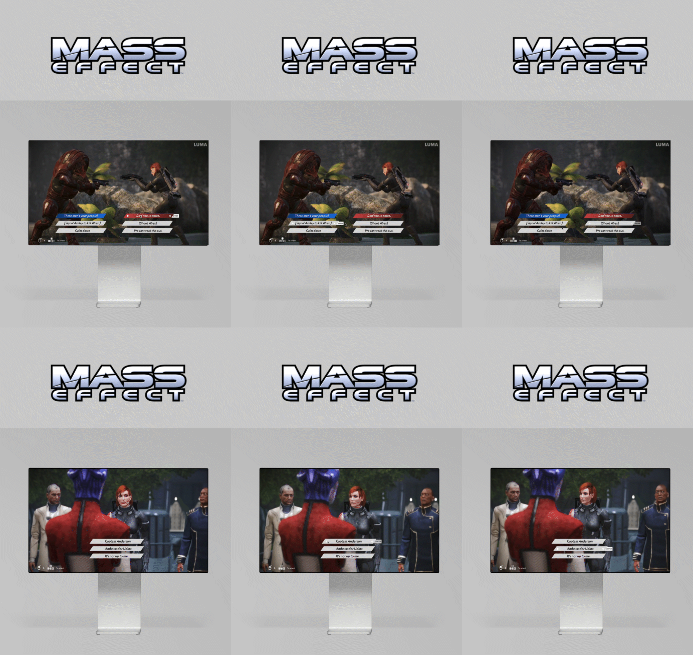
Dialogue Choices
Redesign
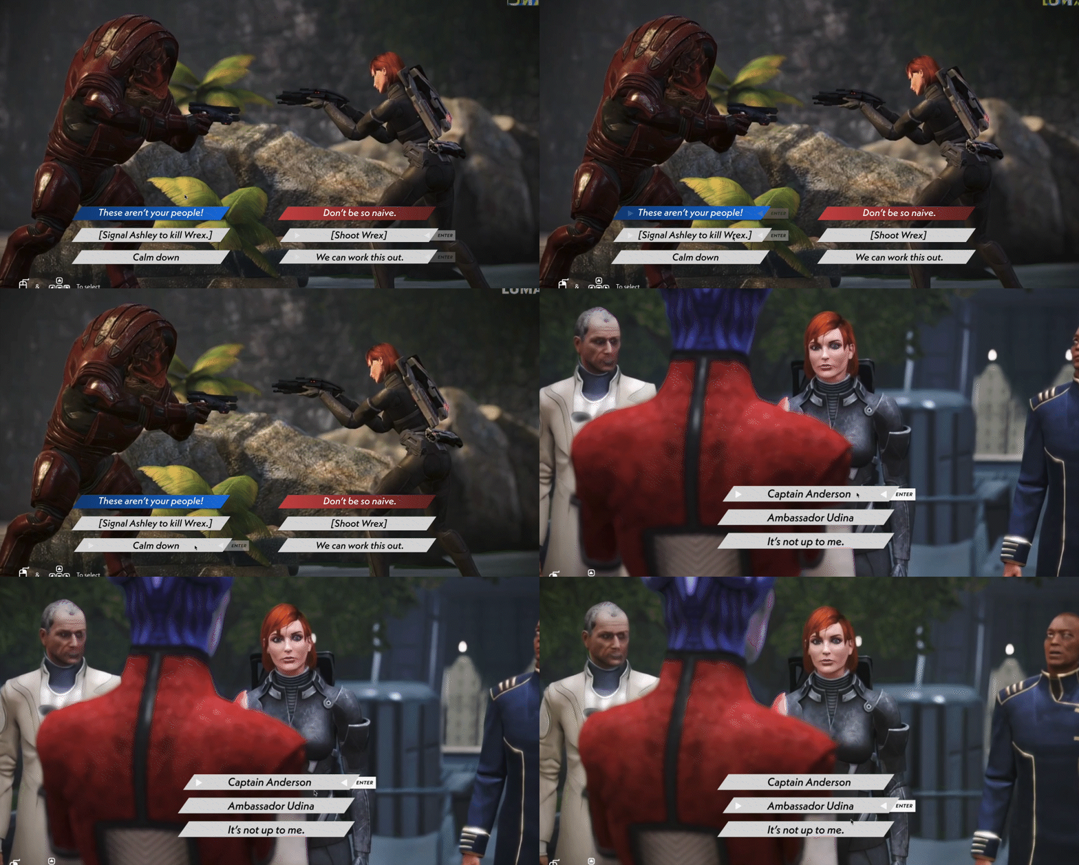
In the original Mass Effect, dialogue choices are categorized into good, evil, and neutral decisions, represented by blue, red, and grey colors respectively. However, the proximity of the options often led to players accidentally selecting the wrong choice.
In the redesigned version, I addressed this issue by improving the spacing and layout of the dialogue options. This ensures players can clearly distinguish between choices and navigate their selection accurately, reducing the chances of making unintended decisions. The redesign enhances the overall player experience by prioritizing clarity and precision in dialogue interactions.
Original & Redesign
Equipment
try this on Figma
Reflection
Redesigning the UI for Mass Effect (2007) was a challenging yet rewarding experience that allowed me to delve into the complexities of game interface design. The project required balancing functionality, aesthetics, and user experience while staying true to the game's iconic sci-fi theme.
One of the most significant lessons I learned was the importance of user-centered design. Conducting surveys and gathering feedback from players provided valuable insights into the pain points of the original UI and helped shape the direction of the redesign. It highlighted how critical it is to understand the audience's needs, preferences, and behaviors to create an effective design.
The iterative process of sketching, wireframing, and peer reviewing taught me the value of adaptability. Each stage revealed areas for improvement and opportunities to refine the design further. Adding motion design elements to the high-fidelity prototype was particularly challenging, but it brought the UI to life and created a more immersive experience.
Ultimately, this project demonstrated how thoughtful redesign can enhance usability while respecting the original design's essence. It reinforced my passion for creating engaging, user-friendly interfaces and deepened my appreciation for the role of UI in storytelling and gameplay.

