Introduce
MT. Bike Website development
Project info
Duration: 4 weeks
Role: Web designer, front-end developer
Team: Solo project for MT. Bike Shop
Skills: Responsive Web Design, UX/UI Design, Wireframing, Prototyping, Animation, Interactive Design, Problem-Solving, Version Control
Project overview
I was tasked with creating a website for bicycle shop, which offers a range of products including mountain bikes, road bikes, accessories like helmets and shoes, as well as repair services. The website was built using HTML, CSS, and JavaScript.
Challenges
- Ensuring a cohesive design and user experience across more than five pages while maintaining a well-organized structure.
- Implementing the CSS grid layout efficiently across multiple sections of the website without compromising responsiveness or design quality.
- Managing the front-end development entirely solo, including troubleshooting and debugging issues in HTML, CSS, and JavaScript.
- Balancing aesthetic appeal with functionality, especially when integrating product details, services, and an intuitive navigation system.
- Optimizing the website for different screen sizes and devices to ensure a seamless user experience on both desktop and mobile.
Tools
Moodboard
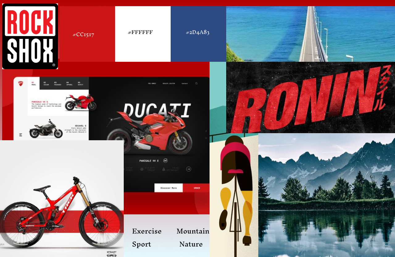
I set out to design a website inspired by a vibrant color palette of red, white, and blue. These colors were carefully chosen for their symbolic connection to themes of exercise and nature. Red represents the warmth of the sunrise, a time when many people begin their day with physical activity, such as cycling or jogging. Blue captures the calm, expansive sky, reflecting the open and refreshing views people often experience during outdoor exercise. Together, these colors create a sense of energy and serenity, aligning with the project’s focus on health and the outdoors.
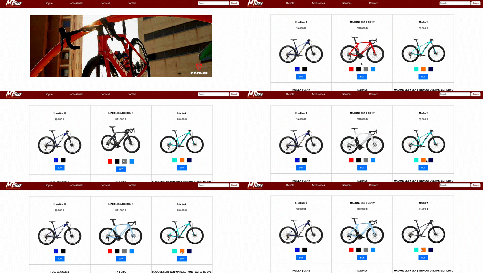
To bring this vision to life, I began the process by creating a moodboard to solidify the visual direction and overall aesthetic of the website. Next, I developed a wireframe to map out the layout and ensure a clear and user-friendly structure. Once the foundational planning was complete, I moved on to the development phase using Visual Studio Code to craft the index.html page.
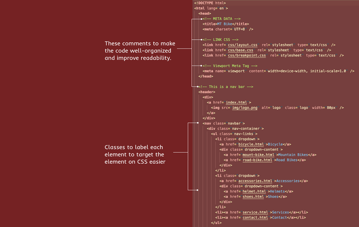
Throughout the coding process, I meticulously organized every element using clearly defined classes. This approach allowed for a streamlined CSS workflow, enabling me to efficiently style and maintain the project. The careful planning and thoughtful implementation ensured that the website not only aligned with its conceptual goals but also delivered a polished and functional user experience.
Reflection
I am proud of the progress I made from initial concept to a functional website. The choice of a red, white, and blue color palette was a deliberate decision to evoke feelings of energy, health, and connection with nature. These colors not only shaped the visual aesthetic but also helped create a narrative that resonates with the themes of exercise and the outdoors.
Working with Visual Studio Code to build the website was both challenging and rewarding. Organizing elements with well-structured classes proved invaluable for efficient styling and maintaining a clean workflow. I also gained a deeper understanding of how to bridge design concepts with practical implementation, which enhanced my coding skills and attention to detail.
Through this project, I learned the importance of balancing creativity with functionality. While the visual design is key to engaging users, ensuring the website is accessible and easy to navigate is just as critical. This reflection inspires me to continue refining my skills and tackling new challenges in web design and development.
Wireframe
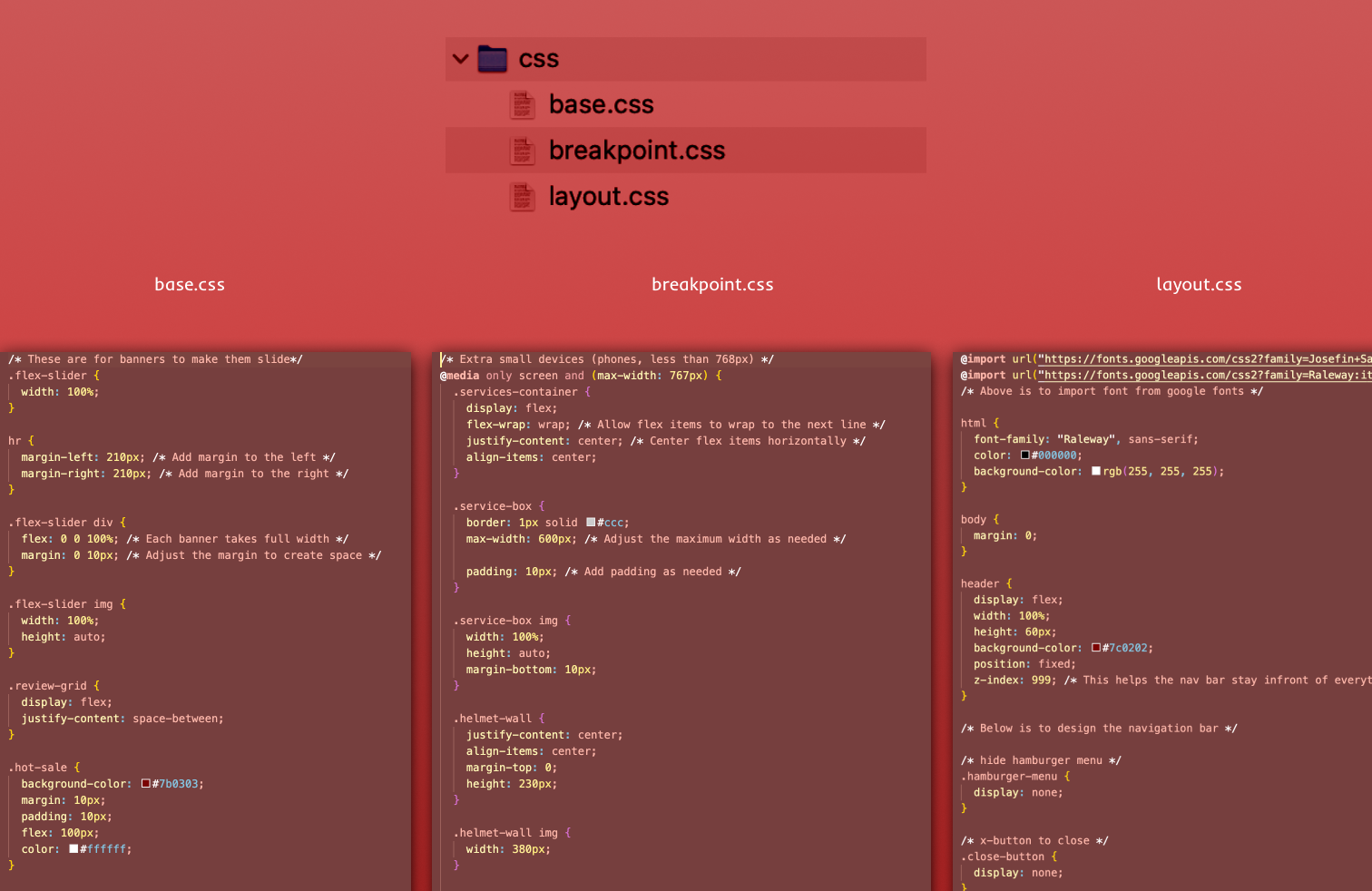
I have three css files to organize: layout.css, base.css, breakpoint.css
base.css: Contains default margins, and padding, which apply universally across the entire site.
layout.css: Focuses on the structure of the website, including grid systems, containers, and positioning of elements.
breakpoint.css: Handles responsive design, applying media queries to adapt the layout and styles for different screen sizes (e.g., mobile, tablet, desktop).
